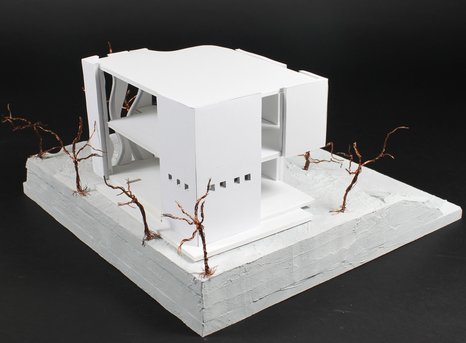
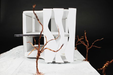
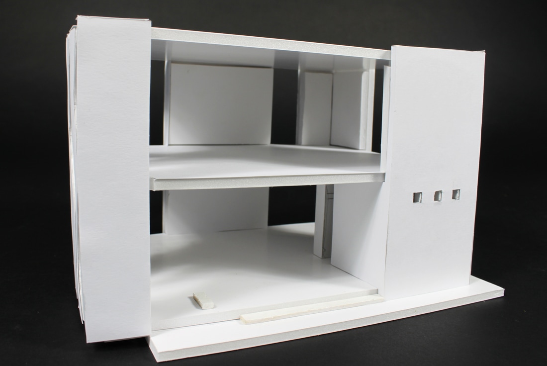
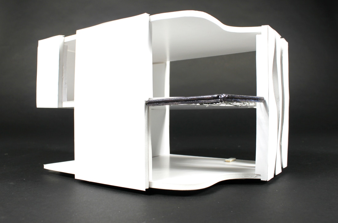
Project 02: Cliff House
Project 2
Documentation and Review:
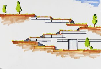
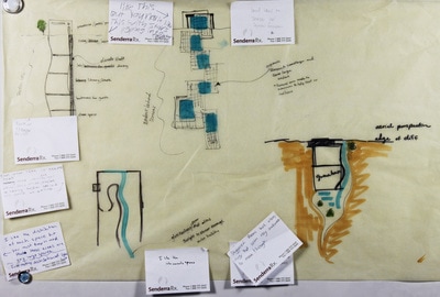
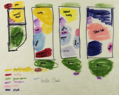
Prior to developing design ideas on the project, we delved into the world of Emilio Ambasz and his five design methods. I focused on levels of greenery.
Next, we began developing rough design ideas and conducted group critiques on the work.
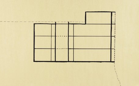
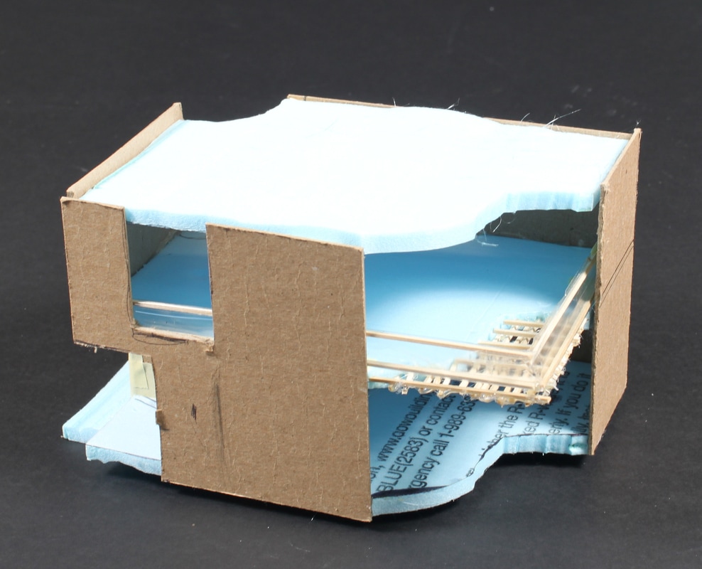
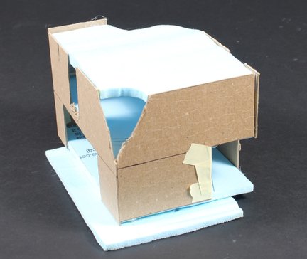
Initially, I planned on a four story 20x100x20 construction to house the lab, guest accommodations, and main home. After visiting the Kimbell Art Museum and getting to see what a 20x20x100 space felt like, I decided to expand construction farther into the site and substituted the curved courtyard for a rectangular courtyard dividing the main home from an additional, more private expansion.
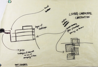
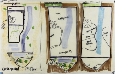
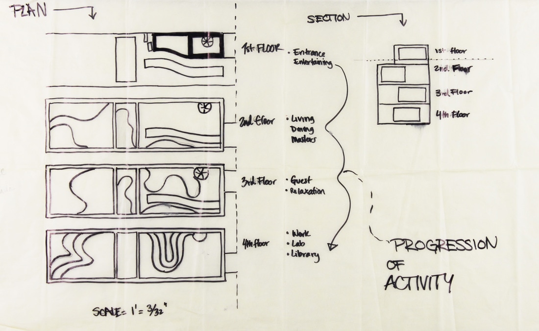
The building is separated into two different ways: by its use (horizontally divided) and by its level of privacy (vertically divided).
The first floor is designed as an entrance and entertainment space.
The second floor is positioned around main living for the homeowners. Living, dining, kitchen, and the master suite are all on this floor to allow for ease of use and minimal movement up and down stairs.
The third floor is designed as guest accommodations. Complete with a living space, guest bedrooms, bathrooms, and a private suite, this floor is all guest could ever want. Also, they are right beneath the main living and dining as to encourage interaction with hosts and proximity to refreshments.
The fourth floor is reserved as the home's lab and library. At the very bottom of the home, this floor is the quietest and darkest floor. In line with the client's requests, this floor caters to the intellectual and offers dark contemplation space for the hosts and guests.
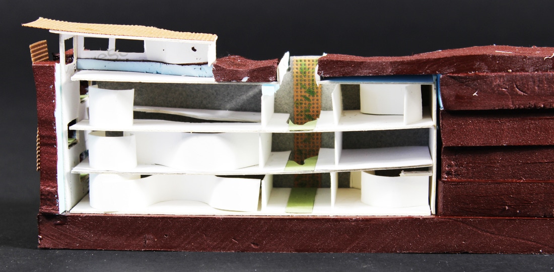
The main building, accessible from the top floor foyer, is designed as a more public space. Full of light and more transparency, this part of the home houses the social spaces.
The extension, accessible from the internal courtyard from the main house second, third, and fourth floors, is reserved as private space. With light exclusively filtering in from the courtyard, these spaces are darker, quieter, and more intimate. The second floor's extension holds the master suite, lockable to offer security from guests. The third floor's extension holds the guest suite, designed to house long-term, favored guests. The fourth floor's extension houses the lab, out of the way and lockable to prevent the loss of decades of work, artifacts, and thousands of dollars worth of valuables.
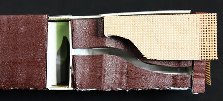
The end building design featured large windows on the cliff side, screened by an organic trellis and greenery to create privacy and prevent glare for park goers on the others side of the ravine. Light also streams through the floors of the excavated home through a curved glass skylight that begins on the ground level and continues until the ceiling of the fourth floor.
Entrance is made through the greenhouse doors, through the greenhouse, and into the foyer. An internal staircase leads guests down into the heart of the home.
Entrance is made through the greenhouse doors, through the greenhouse, and into the foyer. An internal staircase leads guests down into the heart of the home.
Project 01: Park Wall Building
The design objective is to create a creative and sustainable structure that solves a problem for a Texas State Park. I chose Pedernales Falls State Park. I am proposing to create an artistic rest-stop for the park's hikers, bikers, and equestrians. The structure is complete with restroom facilities, cover from rain and sun, and an observatory.
Project Research:
Click link for the research pictograph.
Project 1
Documentation and Review:
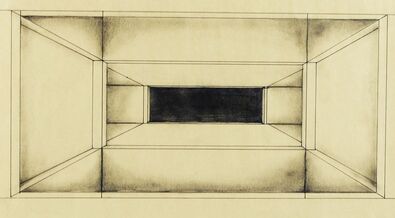
Before my class began our project research, we explored the architecture of Mies van der Rohe and were commissioned to create a piece of art inspired by his work. I was attracted to his buildings' continuity of space, light, and smooth surface. His buildings all commonly possess some continuity of view. In an effort to capture this, I imagined a maze of walls and and passages. I reversed the concept of light with dark and attempted to create an effect of darkness down the passages.
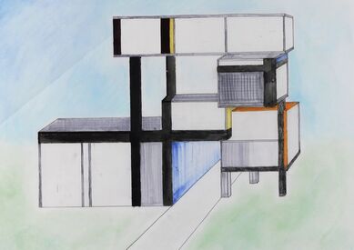
Next, we explored the masterpieces of Mondrian. We were to draw a piece of architecture that captured the essence of his work. As I was heavily drawn to his heavy, angular lines and bold colors, I deemed to pair them with a eclectic dimension aspect. I altered his colors slightly and used grays and whites to become the background of the building.
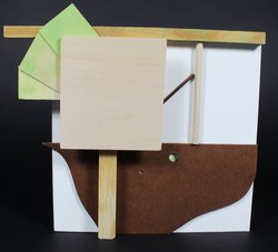
Also we briefly discussed the De Stijl art movement and created our own pieces of art.
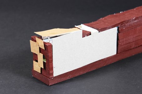
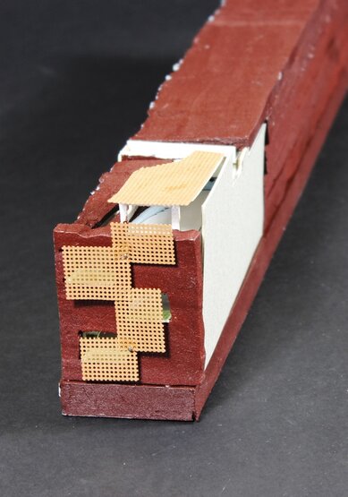
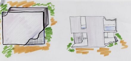
Eventually, we delved head first into the project. My initial concept was to create a modern building that played off Mondrian's angular approach. I leaned towards smooth surfaces. I knew that I wanted to make the building become one with the environment despite its inorganic aesthetic. To achieve this, I dabbled in erosion on box sides of my modern box to mimic the river and create traffic to unique views, pulling from Mies' trend of continuity of light and view.
Soon after, I built a study model.
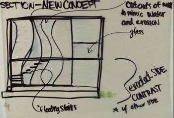
As I refined my ideas, I decided to concentrate the erosion to only one side of the building and to leave the other side completely angular and intact. I imagined a floating set of stairs and glass railings that offer protection, but allow for complete view.
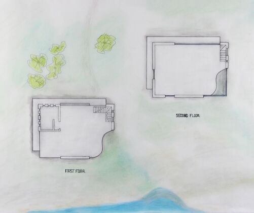
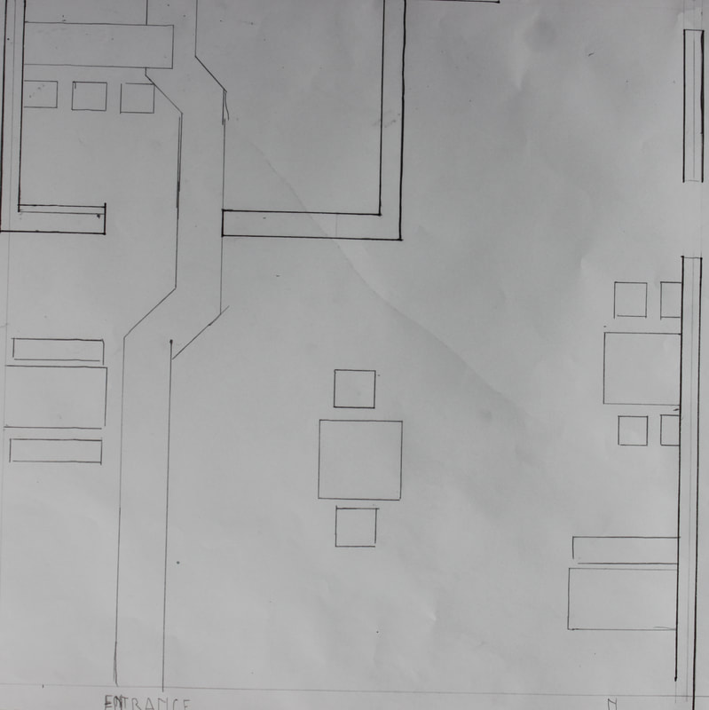
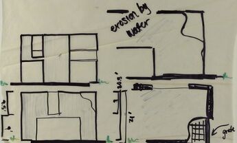
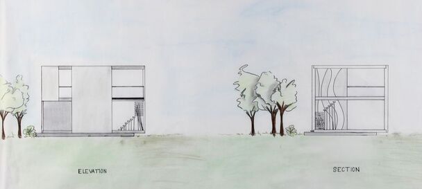
In the conclusion of our project, we were commissioned to draw up a presentable site plan and include the levels to our building in a cohesive floorplan style. In addition, we were required to create an elevation/ section drawing.
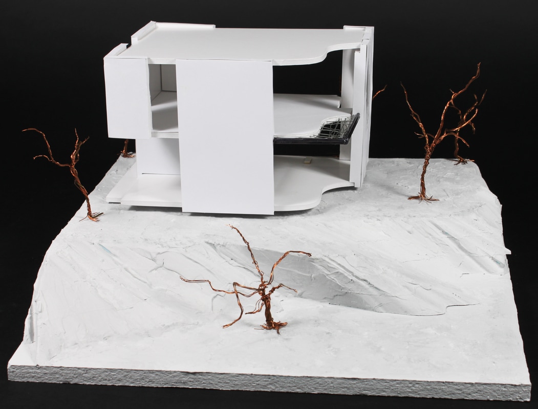
I also built a final model to represent the building concept. Constructed from foam and plaster, the landscape has minimal color to allow for focus of interest on the building.
