Cabot Ferguson: Architectural Design II
Project 01: Border Work/Study Zone
|
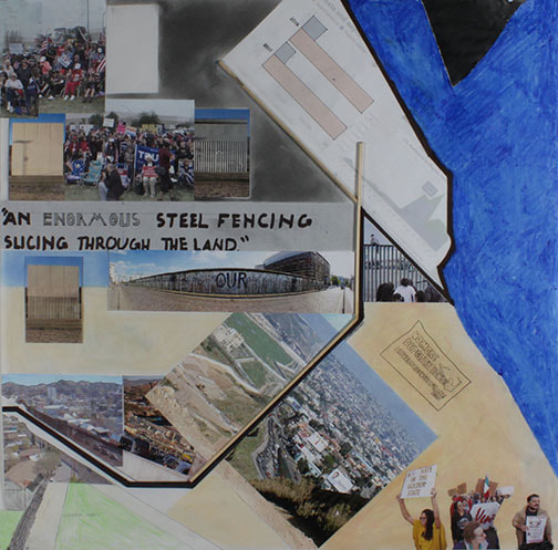
This Project was centered around the U.S./Mexico border wall that is currently being discussed all around America. Our objective was to design a community center, and media library, that was capable of supplying technology, internet, and connection to both sides of the wall. The building was meant to promote the amicability of both countries along with symbolize the unity of their cultures. It had to contain at least one element of connection in both the interior and exterior of the house, along with be roughly 1,000 sq.ft. and contain landscaping elements as well.
|
Verb Studies
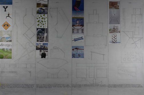
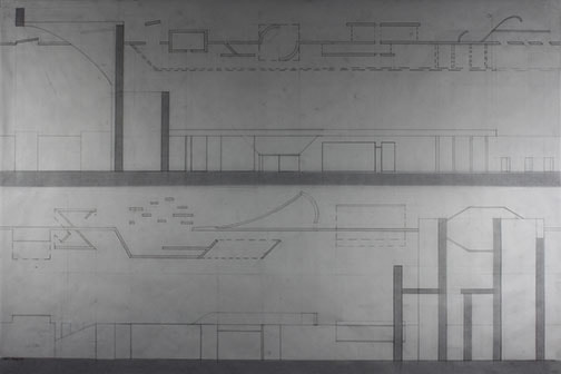
We began the project with an exercise in how verbs relate to architecture we where given a list of 10 verbs: inflate, branch, bend, lift, embed, rotate, shift, carve, grade, notch; we where able to focus on 4 specific verbs in our first exercise. In the subsequent drawing we where able to explore every verb and how they affected each other, in addition to how they affected both negative and positive space.
|
Verb Analysis Drawing
|
Multi-Verb Study Drawing
|
Concept Design
|
|
|
After I finished studying both the culture of the borderlands along with the different ways of manipulating space, I began looking at different ways of breaking up the wall and connecting the spaces on both sides of the wall. I mapped out the separate "rooms" I would need inside each building, and how they would all flow together. I tried to create a parallel on both sides to show how all humans are equal, but I also had each design differ as a way to show that; even if we have different cultures, we are still one community. Furthermore, I also looked at ways to connected the two sides of the border. I used the imagery of a stream of water colliding with a rock much like the two cultures colliding and pushing up against the border, this led to a very flowing design with lots of curved roofs.
Final Drawings and Model
For my final design I opted for a pylon-like wall that allowed for the bottom of the wall to be fencing rather than a solid form, this connected the visually. I looked at different senses to utilize in order to connect the populations and ended up creating a "sky-bridge" that pushed the building vertically that contained a wall of copper in order for both sides to hear each other and feel the heat of the other side being conducted. I decided to go with an aluminum cladding for the walls and a floor that utilized the soil content of the site to create RAM flooring. The floor plan of the building is built around a central wall the intersect the border wall and is present on both sides; this wall is made of thermal magnesium concrete because it is sulfur free and conduct temperatures very well. Both kitchenettes and media libraries parallel each other as a way to create a sense of community on both sides of the wall through similarity.
Project 2:Borderlands Work/Live Site
In the second project of our semester we where tasked with crating a house and a work space for our respective clients. The client given to me was a middle-aged Mexican doctor, Jorge Sanchez, along with his wife and 2 kids. Given these perimeters, I built a neighborhood clinic and a 2 story, 3 bedroom house that all sat on a 150' by 300' rectangular lot.
Concept Design
|
|
|
Using the ideas and research I gathered in our first project of the semester along with concept I discovered while finding inspiration for this project, I began to craft my designs. With the living space, I began by taking a traditional square and morphing it into a piece of Mexican architecture. Then I used shipping containers to interrupt the Mexican ideas at work with a more American style within the containers. This allowed me to connect the two separate cultures within the building by celebrating their differences. With the clinic I took a slightly different approach; rather than focusing on the culture, I looked at how to incorporate scientific and mathematical notions within the building's design. I specifically looked at creating a design that played off of the "golden ratio", a mathematical ratio that appears recurrent in many living and non-living things throughout Earth's history, in order to tie both nature's beauty and the beauty of medicine together in one space. Furthermore, in my site I looked to position the buildings in a way that kept them reserved to the outside world, enticing the public to further investigate the site's private spaces.
Final Product
My final designs focused greatly on the relationship between the indoor and outdoor spaces along with the concepts previously discussed. My living space is built around a modified version of the traditional Mediterranean style courtyard, that focuses on the notion of public/private spaces within an outdoor setting. This courtyard cuts through the building's geometry on the first level but acts like a river that the second floor's outdoor patio must ridge across. To accompany the building's connection to the outdoors, it supports two grass roofs(above the garage and the master bedroom) these roofs help insulate the spaces sheltered by them, along with connecting the second floor with the ground level. Within the clinic, I looked to imitate the compartmentalization of a Nautalis shell, a sea creature that is widely known due to its relation with the golden ratio, along with its overall profile. I utilized shipping containers as a device to break up the curved profile of the shell design and to create a connection between the clinic and the living space. The grass roof of the clinic was tasked with obscuring the clinic and making it blend in with the landscape surrounding it. I connected the roof with the landscape of the site in order to better emphasize medicine's connection with nature. Both design share similar ideas such as the living roofs, shipping containers, and the connection with the indoor and outdoor spaces.


