LE CORBUSIER INSPIRED HOME
This project was centered around Le Corbusier's Five Points of Architecture:
- The Pilotis
- Free Design of the Facade
- Free
Design of the Ground Plan - The Horizontal Window
- The Roof Garden
This first picture is of all the sketches I made for the project. It is read right to left and the idea does not change much throughout the design.
The slideshow below contains close ups of different sections from the sketch above. The first picture is not included in the sketches above because it was done later. The sketches focus primarily on floor plan and not the outside design.
I then made a study model to see how the ramps would look wrapped around the house like I wanted them to be and where I would need to put the supports.
The first floor represents the father's garage where he can work on his cars. The entire front part of that level would be a garage door to allow for easy access to the cars. The second level is the family area with the kitchen and living room, and also the son's indoor oasis would be put on this level. Trees would be placed here to allow him to play indoors and climb trees and do fun outdoor things that he may not get to experience living in Dallas. The second level is the children's rooms. The daughter's half is for her room and crafting. The brothers half allows access for the llama to enter the house, his room and is open to the indoor oasis. The thrid floor is triangular shaped for the trees and is the parent's room. Lastly, the parents room leads up to a dome on the top of the house to let the mother worship the moon. There are no doors between floors, only up the ramp leading to the parents room. The plan with the ramps having no doors is to make a connection between the family, so even though each of them were doing their own thing, they could all still hear what the others were doing.
For the materials on the building I planned for it to be a mix of slats of light colored wood and oxidized metal.
5 POINTS HOME
MILLENNIAL HOME
For this project we had to create a home for people of the millennial generation. That includes people born from 1980-2000. The project is located in Old Town Lewisville and it had to be a at least a two story building. The first floor was used as the clients business and the second floor was used as living space. My clients had a family of three, with a two year old daughter, and a dog. They enjoyed lots of light, hosting parties, baking, and being outdoors.
The first picture is the original sketches for the building. I had the second floor a uniform width with the first and had the idea for a back entrance. The second and third pictures are layouts for the house after I decided to widen the second floor.
Towards the middle of the project, I developed my idea to add more space to the home by extending it over the tops of the buildings next to it. This was the very beginning of the idea. The roof entrance was also in a T-shape to hold a green house, but I got rid of the idea. There was also going to be a back entrance but that space was turned into a bedroom, so I got rid of the back entrance and just went with the front door.
I planned on the whole building conforming with old town. The first floor would have been a brick plaster mix with the second floor being all brick. However, as my project developed, the design changed and so did the weight of the materials that were needed. I began to use a study model to look at different building shapes. This was the final design chosen. I wanted to keep the original look of old town, but we wanted the house to have a completely different look to it. Because of that, I wanted to keep the two separate; the old and the new. I lifted the second floor upward and placed it on two poles to hold it above the first floor.
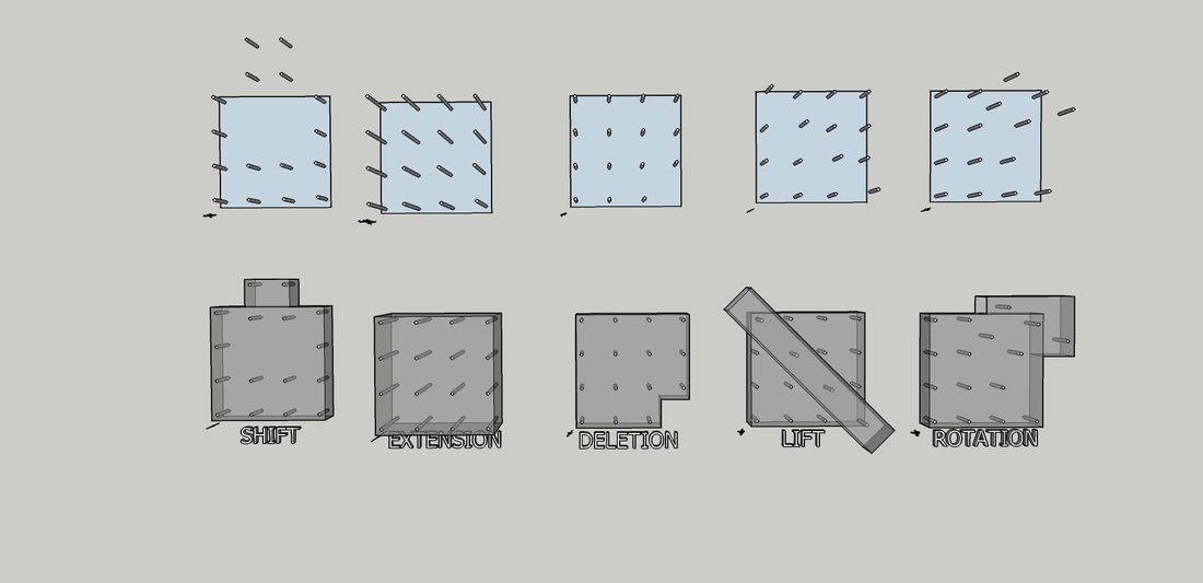
For the final product, the building was meant to show a separation in the old and new, but still highlight the first floor within the second. The over-hanging window and the back window are both 25 ft. wide which is the same width as the first level. The glass box on top is also 25 ft. wide and the space between the two skylights is also 25 ft. wide to further emphasize the first floor. The last photo represents wall ideas that were incorporated on both levels. Earlier I mentioned that I wanted to keep the look of old town, so the first floor remained as a brick plaster mix on the outside (the right and bottom walls). The shape coming out from the center is a tree that is in the center of the site location. I wanted to save the tree and it would've been placed on the roof to shade the glass box. The paper clips were used on the floor. They are black, metal and are laid over the brick of the building next to it. The left wall is copper and is the outer material of the second floor.
These are the final floor plans for the building.
WALLS
|
http://www.cbsnews.com/news/the-millennials-are-coming/
|


