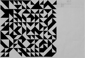
Word ProjectThe first step in designing a small house was with the word project. Based on specific fine art pieces, the word bold was chosen for this project. In order to express the word bold through shapes and pattern, triangles and harsh corners were used to convey the term. When one thinks of "bold", the subtlety of circles or ovals does not come to mind, hence the reason why triangles were chosen. The black and white also help express the word bold, when looked at one way, it seems that the white triangles are at the forefront, when looked at another way, the black triangles are forefront. In both cases, one set of shapes contrasts against the other, becoming more prominent, "bold".
|
|
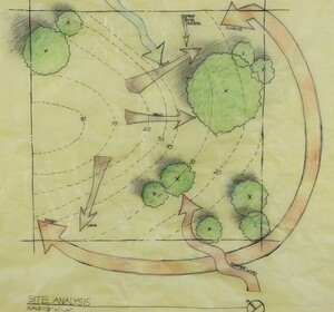
Site Analysis
|
The next step was to research where the house would be located, this house would be located in Pima County, Arizona. key factors were taken into consideration such as the climate, seasonal wind patterns, and the types of trees located in Arizona. Arizona's climate is known to be extremely hot, containing very few trees, these factors would later be taken into consideration when designing the home along with the unique contour lines of the location. A rough draft of the location was drawn on trace paper and later transferred onto yellow trace paper to be finalized.
|

|
|
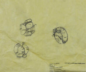
Bubble Plan |
|
The basic layout of the rooms that the home would contain was roughly sketched in no specific form. In doing so, the decision was made to have one of the biggest rooms in the house be the library/work place. This was done so that the word bold would be apparent in the design, while also making good use of the work space by adding an additional purpose to it. The other rooms, though originally scattered throughout the house, would eventually be placed at the front, leaving the workspace at the back of the house.
|
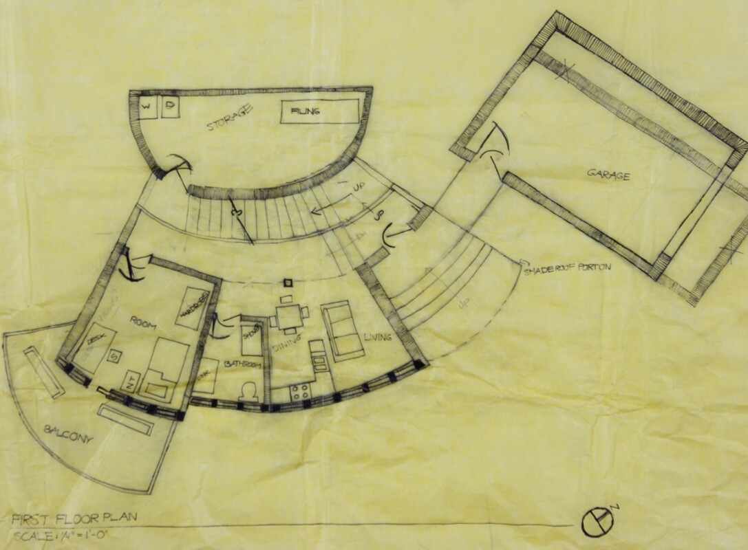
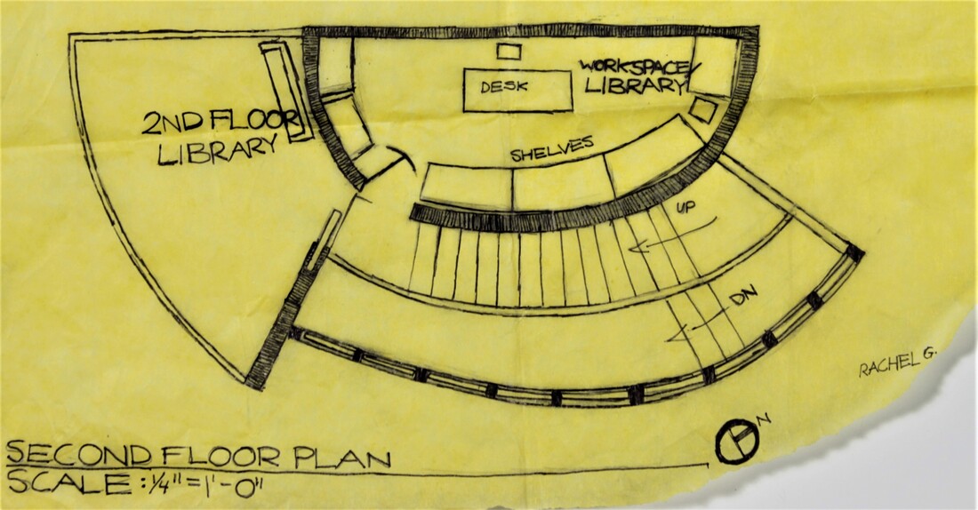
First and Second Floor Plans
When making the floor plans, the decision was made to have the first floor be the area in which you would find the living, kitchen, dining, bathroom, and sleeping area essentially all in one specific area against the wall of the house. This allows for easier access as well as a good use of the space given. Multiple balconies were added to allow the views from the site to be shown, and windows were placed all across the wall of the first floor wall to let natural light in in addition to a view of a desert willow located at the front of the house. The second floor was designed to contain the work space as well as a balcony. Underneath this office, on the first floor, is a storage unit. The garage was specifically placed next to the house in the path of the front door so there would be easier access to the house, which in the roof plan would be shaded by a roof that sticks out over the porch as well as the steps leading to the porch.
4 ElevationsThe elevations of the house illustrate the railing of the balconies as well as the placement of windows. In contrast to the taller windows of the first floor, the second floor windows simply line the top of the second floor wall of the office area. This was done to allow sunlight into the room while also leaving space for the shelves that line up against the wall on the inside.
|
|
House Model
Although no longer accurate to the current design of the house, this model expresses the rough idea of what the home would look like from the outside. Changes were made to the position of the space containing the stairs which no longer lines across the entire wall, but instead now resides in the middle left to make space for the entrance of the house. The workspace is also no longer one tall room, but a separate one on top of the storage unit.
AutoCad Site Plan
|
The site plan, originally done on trace paper, was transferred onto AutoCad. Property and building lines were added as well, providing a precise location of the house on the site. This proved to be an issue with the original placement of the home, as it was out of the property line. To address this, the home was moved further up onto the site as well as the garage having to be pushed up closer against the house.
|
AutoCad Updated Floor Plans
|
Many changes were made when making the floor plans, such as the placement of the kitchen table, and placement of kitchen essentials (stove, sink, dishwasher, etc). Originally the kitchen table was a square table that resided just in front of the L shaped counter. This proved to be an issue as it was a very awkward placement for the dining table, and would be difficult to get around when in the kitchen. So the dining table was instead converted into a pull out table against the bathroom wall, with a few chairs behind it. This allowed the space in front of the kitchen to be open, so people could move more freely in the kitchen space.
|
AutoCad Elevations
|
While making the elevations, the placement of windows was changed, as well as the location of the space containing the stairs leading to the second floor. Instead of having tall windows too close to each other, the windows were shortened and more evenly spaced out along the first floor wall. The windows also no longer continue onto the walls of the sleeping area, as there simply was not enough room in addition to a sliding glass door already being there as an entrance to the balcony. The space that contains the stairs was also moved towards the middle left to create more space for the entrance and more accessible to the second floor balcony.
|
