Maya Espinosa: Architectural design II
Project 01: Urban House for a Painter
|
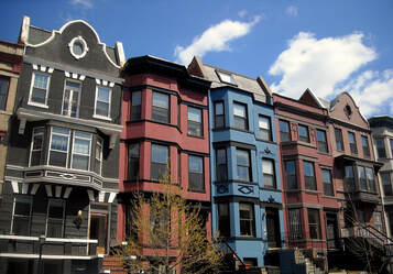
A painter reached out to me with a special project to modernize a traditional styled Row House. The Artist purchased an abandoned house in the heart of a populated city adjacent to other similar buildings with traditional characteristics. The project was to renovate the house and integrate the Artist's painting style into the building so the Artist can "live and work" within their painting. Although, the painter wants to respect the neighborhood's historical qualities.
|
Existing House: Row House
|
A row house is a group of buildings that share one or two walls and rooflines with adjacent buildings. They typically house one to two families and are from two to five stories tall. Similar from a townhouse, a row house is of an identical row and is much less fancy. Row Houses are desirable places to live in because they are generally walking distance to commercial locations, parks, and public transportation. They are usually tube like shaped which does not allow for much light to enter; to contradict this, large windows are located on the front and the back to let light shine through the building.
|
Painting Analysis
|
In the painting Harlequin 1915 by Pablo Picasso, there was a lot of interesting qualities that stand out to the viewer. Four different characteristics that I saw in the painting was planes, pattern, curved lines and white spaces. The tilt in the subjects were very prominent making them stand out so I decided to isolate this specific element to see where theses different subjects intersect. In the middle of the Painting there is very vibrant colors that contrast the shapes and design of the Harlequin making the pattern stand out. The pattern in the painting was very geometric but there were few curved lines scattered throughout that gave the eyes a rest from all the hard lines and corners. The painting had a dark color scheme so in the locations of light colors, those shapes popped out.
|
|
Design Development
Because I was so limited in working with only the front and back walls, I had to think of a way to allow for light and space to be incorporated into my design. My idea was to shift the floors back and forth to replicate the planes in the Harlequin painting. In extending the second floor and shortening the third floor I created a space on the roof where I considered extending the roof but realized I would be blocking out the light from entering the third floor. For the interior walls I took into consideration into keeping all the public spaces on the first floor and all the more private spaces on the second floor and lastly put the artist's studio on the third floor, the floor where light enters In more. With the curved lines in the Harlequin painting, I contemplated putting curved lines in the building but because the building was so narrow It made it difficult to have practical rooms. I observed the locations of the rooms on the second floor and I recognized the similarities in the design of the Harlequin. I decided to integrate the irregular design into the rooms. This worked out nicely because this gave more room for the stairs.
Final Drawings and Model
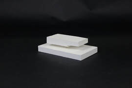
In my final drawing, I placed all the public space on the first floor and had the stairs placed straight ahead from the front door for easy access. On the second floor I put the what I figured to be the most commonly used rooms for my artist right next to my stairs. The rooms furthest away from the stairs would be for any guests. lastly, on the last floor, I placed the artist's studio so the artist can have the most natural light entering the room. Right outside the third floor, there is outdoor space the artist can use to put a garden, or a porch set-up. This outdoor space can serve for inspiration or access to fresh air.


