Grace Laird: Architectural Design I
Project 01: Word Project
|
This project was the basis for Project 02. Each student was assigned a word meant to found the way we designed our future projects. My word was 'whimsical'. By utilizing the research seen below, I interpreted 'whimsical' as something free flowing and out of the ordinary with a small amount of structure and possibly tying into nature. I tried to base my design for this project off of that idea.
I decided to use only circles, rhombi, and triangles in my drawing because to me, whimsy is not overcomplicated or complex. The circles drawn are all various sizes, which is meant to allude to images of balloons or bubbles and give a feel of perspective, like some of the shapes are close than others. Spheres eventually turned into the driving factor behind the rest of my designs this semester as well. I also darkened only a few of the circles, aiding in the airy, floating feel I wanted to convey. I left the middle of the piece devoid of any shapes so that the drawing would not feel too repetitive, like a wallpaper pattern. I purposely drew the triangles and rhombi very small to draw attention away from the sharp edges and angles of those shapes. The triangles and rhombi are meant to slightly ground the piece, like I was aiming for in my interpretation of my word. |
Word project final design
|
Project 01 Research
Whimsical -
Playfully quaint or fanciful, especially in an appealing and amusing way.
Playfully quaint or fanciful, especially in an appealing and amusing way.
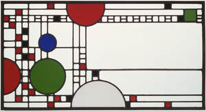
My word was "whimsical". Before researching, I did not really connect with it. Researching the word forced me to consider how whimsy appears in modern architecture, art, and music and how to implement the word into the project. I took a great amount of inspiration from the leftmost image - clerestory windows designed by Frank Lloyd Wright.
Project 02: Tiny Space for Architects
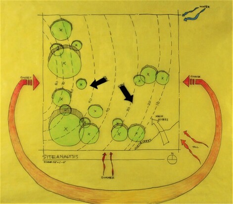
I started by researching and creating a site analysis for the location I wanted to build my tiny space in.
1/8th inch site analysis
My tiny space is located (metaphorically) in Kerrville, Texas. It is known for its picturesque views, hills, and forests. Kerrville has hot, muggy summers and cold, short winters, and is close to the Guadalupe and Medina Rivers. i Picked this location because I wanted to stay in Texas and get beautiful views with moderate weather.
Next, I started some basic sketches of our tiny space using pencil, ink, and trace paper.
Next, I started some basic sketches of our tiny space using pencil, ink, and trace paper.
|
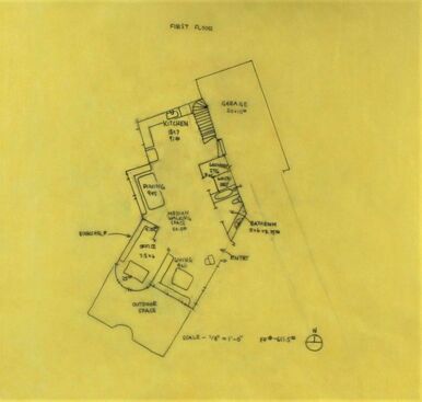
1/8th inch first floor plan
|
My sketches include a floor plan and elevations. When drawing these, I considered how to prioritize my goals. For example, I wanted to create a floor plan that would not require cutting down the trees in my site analysis. This was tricky, but I managed to find a workable configuration for my space. Similarly, I had to incorporate my word into my floor plan. I decided that by creating a round office and an angled kitchen and dining area, as well as a second floor, I could express whimsy. At this point in the project, my outline was fairly rough.
|
Next, I constructed a model of my space and created a wall thickness plan and a roof plan.
These include my model, floor plan, and elevations. When doing my elevations, I got a much better grasp on envisioning my space from all four views and finalized the exterior windows, as well as the roof type. Similarly, constructing the model helped me to see a three-dimensional version of my space and further adjust my design.
These include my model, floor plan, and elevations. When doing my elevations, I got a much better grasp on envisioning my space from all four views and finalized the exterior windows, as well as the roof type. Similarly, constructing the model helped me to see a three-dimensional version of my space and further adjust my design.
I had three main priorities when creating my new floor plan:
1. Incorporate my word
2. Functionalize the space as much as possible
3. Integrate the space into its surrounding nature.
The third goal falls somewhat under the first. To address goal 1, I kept the turned angles in the dining and kitchen walls, living room stairs, and main stairs. The turned angles served as a balance to some of the roundness in the space and provided some continuity, as the majority of the right side of the space follows the same angle. I also incorporated roundness (spheres again) into the office and stairway to create a free-flowing sense.
Goal 2 was achieved by primarily using sliding doors, especially in the spaces that needed to be more out of sight (the bath and storage). I also completed the goal by including furniture that saves space - the stacked washer/dryer combination in the storage room, for example, as well as the desk in the office and the booth seating in the dining room that fit against their respective walls.
The final goal was addressed through a few ways. I included floor-to-ceiling windows in my office and a wraparound clerestory window in the bedroom (seen more clearly in my elevations) to allow the most light into my space. I also (unintentionally) ended up with my house surrounded by trees on three sides. Additionally, I included a fairly large balcony on the second floor facing southeast, as well as a patio outside the living space.
AutoCAD Work
Click to view, the file will open in a seperate tab.
| 2102_lairdg_elevations-model.pdf |
| 2102_lairdg_floorplan-model.pdf |
| 2102_lairdg_secondfloorplan-model.pdf |
| 2102_lairdg_site-model.pdf |
AutoCAD work was pretty tough at first. Figuring out how to offset, measure angles, and remembering to save work, all while staying true to the floor plan was a struggle for me. But in time, I learned how to navigate the program. Essentially, the AutoCAD work consisted of refining the floor plan and elevations. I was so glad to redo my elevations, as they were not correct when I drew them on trace paper. I made a few slight tweaks, but nothing major. It was very rewarding to see my finalized AutoCAD plans (they turned out looking very professional).
Reflection
This project was my first time ever designing a space and learning the rules associated with doing so. I am very proud of the work I have done, and this project has heightened my desire to continue studying and designing architecture.
