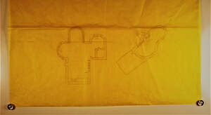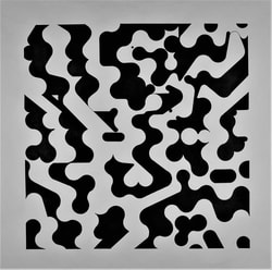
Black and White Word Project:
This project piece was created to express a word that the creator chose.
The project that is shown is meant to express the word "vivid."
This project was intentionally made to look like a flowing river. The white represents water, while the black represents land and rock.
This project piece was created to express a word that the creator chose.
The project that is shown is meant to express the word "vivid."
This project was intentionally made to look like a flowing river. The white represents water, while the black represents land and rock.
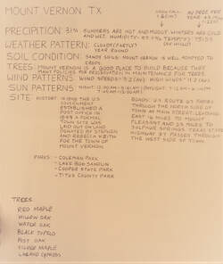
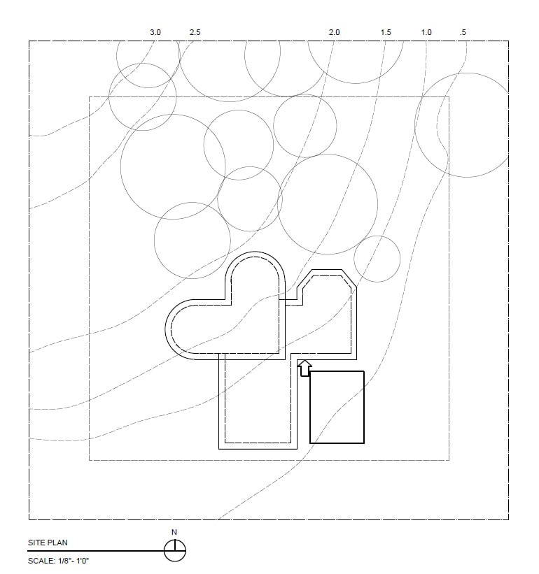
Mount Vernon Information Gathering:
The image shown is a picture of information that was gathered about Mount Vernon Texas.
This information would later be used to start planning a work space in the area.
To create a successful work space, information about the precipitation rate, the weather patterns, the types of trees, and the geography in the area had to be gathered.
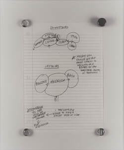
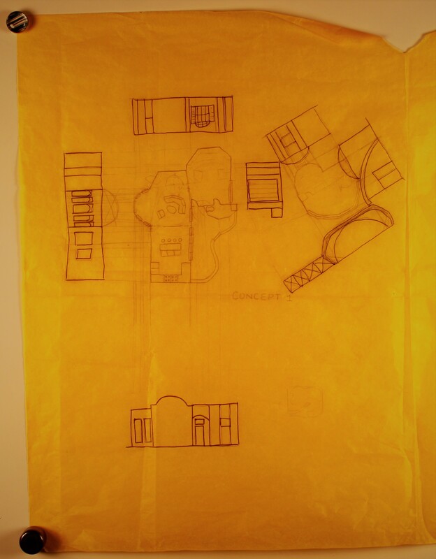
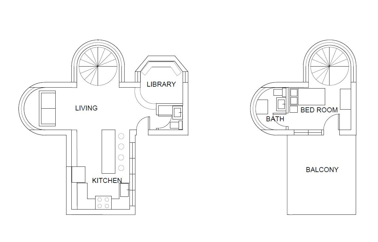
Work Space Planning:
After gathering information and deciding where to build the workspace, it was time to start planning the workspace.
The workspace also had to express the word "vivid" as well which made it challenging to work with.
I wanted a garage, a living room, a kitchen, a bedroom, a bathroom, a studio, and a library. I then had to organize and place the rooms rationally so my workspace would have a reasonable function.